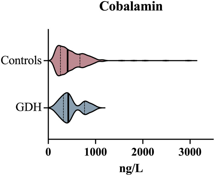
FIGURE 5.

Comparison of serum cobalamin concentrations between a cohort of dogs with GDH and a cohort of control dogs. Violin plots compare the control population (red) and GDH population (blue). The bold vertical line represents the population median and thin vertical lines represent the lower and upper quartiles
