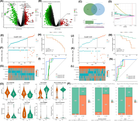
FIGURE 6.

Construction of prognostic models and screening of biomarkers for coronavirus disease 2019 (COVID‐19) patients. (A,B) The volcano plot shows the u‐p and downregulated genes in the blood leukocytes of non/COVID‐19 and cluster 1/2 patients. Red: upregulation, green: downregulation. (C) Venn diagram shows that 355 genes were screened by intersecting differentially expressed genes between cluster 1/2 and non/COVID‐19 patients. (D) Six genes are selected to construct the risk model by least absolute shrinkage and selection operator regression. (E) The dot plot shows the patients' split between the high‐ and low‐risk groups according to the 0.97 cutoff value in the training data. (F) The scatter plot shows the relation between the risk score and ventilator‐free days of the risk model in the training data. 0, no mechanical ventilator; 1, mechanical ventilator. (G) Heatmap of the expression of six genes in the training data. (H) The training data shows the mechanical ventilation probability plot of the high‐ and low‐risk groups. (I) 10‐, 20‐, and 30‐day ROC curves of the risk model in the training data. (J) The dot plot shows the patients' split between the high‐ and low‐risk groups according to the 0.97 cutoff value in the testing data. (K) The scatter plot shows the relation between the risk score and ventilator‐free days of the risk model in the testing data. 0, no mechanical ventilator; 1, mechanical ventilator. (L) Heatmap of the expression of six genes in the testing data. (M) The testing data shows the mechanical ventilation probability plot of the high‐ and low‐risk groups. (N) 10‐, 20‐, and 30‐day ROC curves of the risk model in the testing data. (O) The violin plot shows the difference, including APACHE‐II score, sequential organ failure assessment score, hospital‐free day, free ventilator days, ferritin, CRP, D‐dimer, and procalcitonin, in the high‐ and low‐risk groups. (P) The bar chart shows the proportion of ICU, mechanical ventilators, and ubiquitin subclusters
