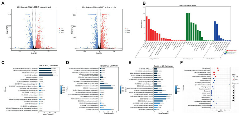
Figure 4.
(A) Volcano plots of the genes that shows significantly differential expression after the 2 MIC and 4 MIC of alliin treatments compared with the normal group. The closer the genes are to the two ends, the greater the degree of difference. (B) GO map of putative target genes. The three colors describe the molecular function, cellular component and biological process of the genes. (C,D,E) GO enrichment bar graph. The first 20 GO terms with the smallest p value were used to draw the graph, the ordinate is the GO term, and the abscissa is the percentage of the number of GO terms for all differential genes. A darker color indicates a smaller p value, and the value on the column is the number of GO terms and p value. From left to right are the enrichment of cell components (C), molecular functions (D) and biological processes (E). (F) KO enrichment bubble graph. The first 20 pathways with the smallest p values were used to draw the map. The ordinate was the pathway, and the abscissa was the enrichment factor; that is, the differentially expressed genes in this pathway were divided by all the numbers. The size indicates the number, and a redder color indicates a smaller p value.

