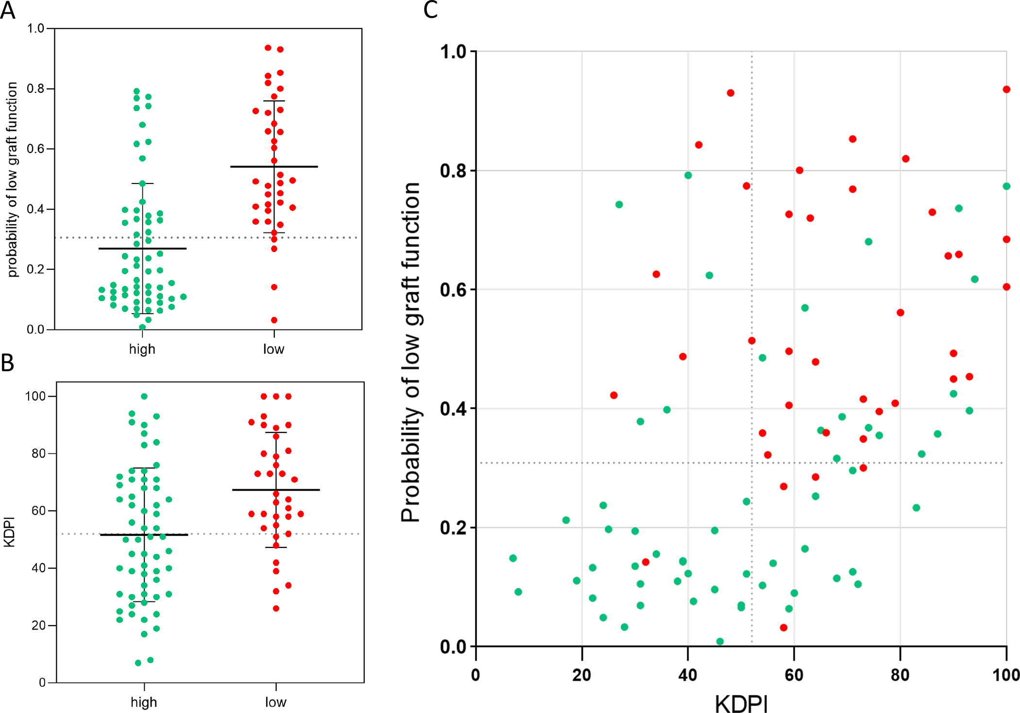
Figure 5.

A. Probability score (derived from predictive equation) of each patient in the validation set (n=96) separated by 24-month outcome group. Dotted horizontal line at 0.306 represents Youden’s index. Mean and standard deviation bars displayed. Green represents high and red represents low 24-month function. B. KDPI score for each patient in the validation set separated by 24-month outcome group. Dotted horizontal line at 52 represents Youden’s index (where specificity and sensitivity are maximized). Mean and standard deviation bars displayed. C. KDPI and probability score of each patient plotted with Youden’s indices depicted for each axis.
