Fig. 3.
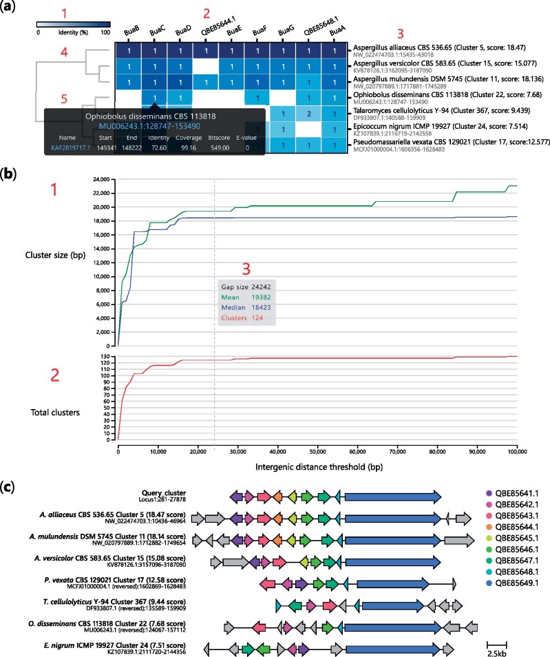
Interactive visualizations generated by cblaster. (a) Cluster heatmap visualization of cblaster search results: (1) heatmap colour bar indicating 0% (white) to 100% (blue) identity; (2) names of query sequences; (3) names of organism and scaffold locations of hit clusters; (4) dendrogram of hit clusters generated from their identity to query sequences; and (5) cell hover tooltip with detailed hit information including hyperlinks to genomic position on NCBI. (b) Gene neighbourhood estimation (GNE) visualization: (1) Plot of mean and median hit cluster sizes (bp) at different gap sizes; (2) Plot of total clusters at different gap sizes; (3) Hover tooltip showing values of mean and median cluster size (bp) and total clusters at a given gap size. (c) Visualization of gene clusters, inclusive of intermediate genes (grey colour), identified in (a) generated using the clinker tool via the plot_clusters module in cblaster

