
Figure 4: Similarity in phenotypic response profiles across six human-derived cell lines.
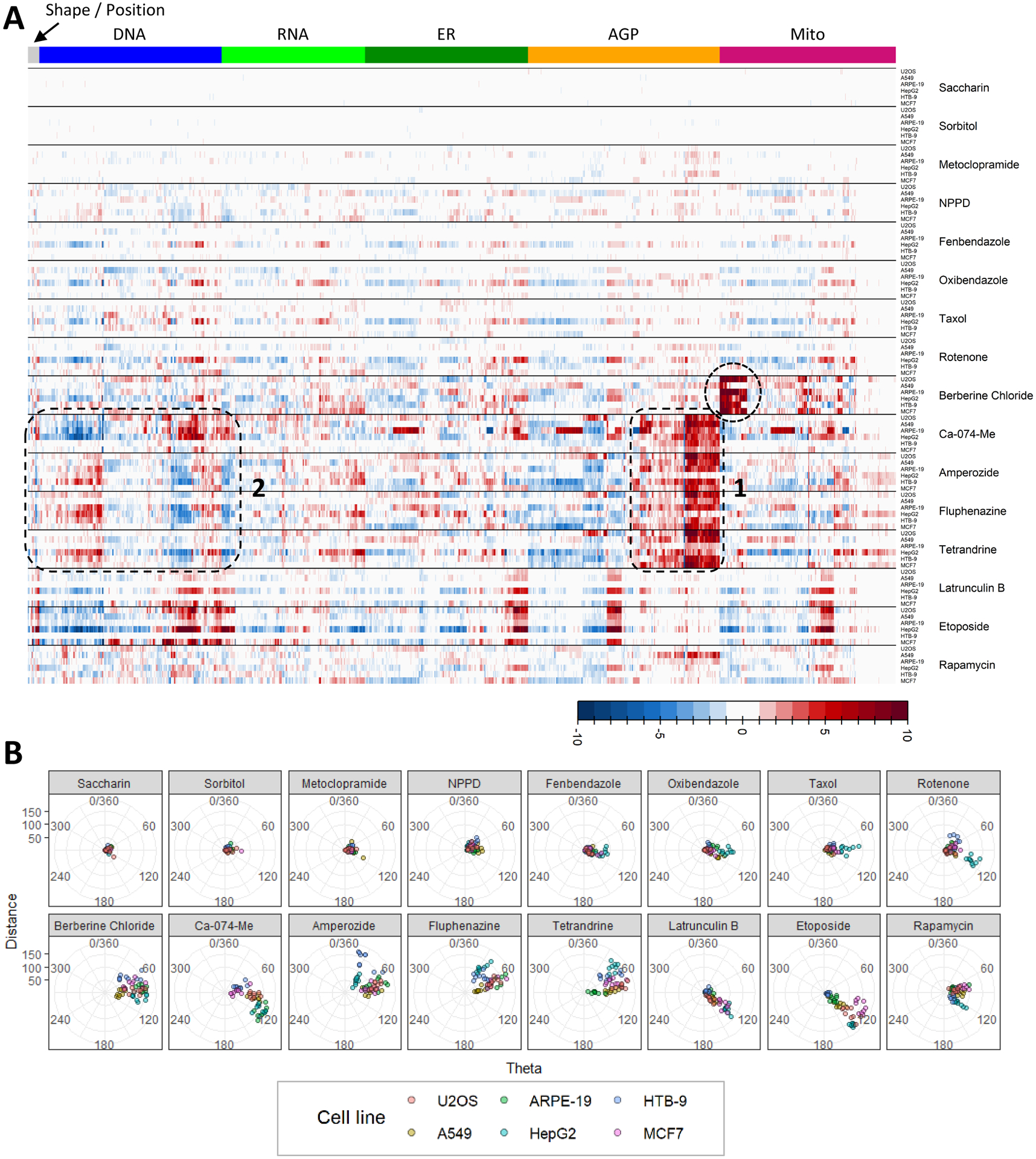
(A) Summary of phenotypic effects for the highest non-cytotoxic test concentration of each chemical. Well level feature data were normalized and scaled per plate, then averaged. The columns of the heatmap correspond to the 1300 phenotypic features, organized by fluorescent channel. Rows correspond to different cell types treated with the chemicals listed to the right of each heatmap clade. Colors in the heatmap represent the magnitude of increase or decrease in a measured feature with respect to DMSO control. Dotted circles or boxes denote areas or similarity or dissimilarity in phenotypic response profiles as described in the text. (B) Theta cell comparative scoring (TCCS) radial plots, faceted by chemical. Data from the highest non-cytotoxic concentration of each test chemical were analyzed using a modification of TCCS analysis (Warchal et al. 2016). Each point represents and individual test well (n = 9 test wells / chemical / cell type). Points are color coded by cell type. Points relatively further from the origin (distance) indicate relatively more robust phenotypic effects and points positioned along similar angular degrees (theta) are indicative of relative similarity in response profiles.