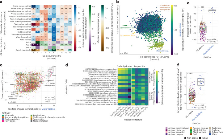
Fig. 5. Metabolite–microbe co-occurrences vary across environments.
a, Correlation between metabolite loadings from the co-occurrence ordination (that is, co-occurrence PCs) and (1) log fold changes in metabolite abundances across environments, (2) metabolite loadings from the ordination in Fig. 3d (that is, Global distribution, axes 1–3) and (3) a vector representing the overall magnitude of microbial taxon abundances from the ordination in Fig. 3d (that is, Global distribution, Overall magnitude). Values are Spearman correlation coefficients. Asterisks indicate significant correlations (*P < 0.05, **P < 0.01, ***P < 0.001). b, The relationship between log fold changes in metabolite abundance with respect to ‘Water (non-saline)’ and the first three PCs of the co-occurrence ordination. Points represent metabolites, and the distance between metabolites indicates similarity in their co-occurrences with microbial taxa. Metabolites are coloured on the basis of log fold changes with respect to ‘Water (non-saline)’. Arrows represent specific microbial taxa (colours), distances between arrow tips indicate similarity in their co-occurrence with specific metabolites, and the direction of each arrow indicates which metabolites each microbe co-occurs most strongly with. c, The relationship between log fold changes in metabolite abundances with respect to ‘Water (non-saline)’ and loadings for metabolites on PC1 of the co-occurrence ordination. The correlation is one example from a. Metabolites are coloured by pathway. Select carbohydrates (excluding glycosides) (the focal group) and select terpenoids (the reference group) are highlighted. d, The top 10 co-occurring microbial taxa for all select carbohydrates and all select terpenoids, with a heat map showing co-occurrence strength. e, Log-ratio of metabolite intensities for select carbohydrates and select terpenoids. f, Log-ratio of abundances of the top 10 microbial taxa associated with select carbohydrates and with select terpenoids. For e and f, points represent samples, and results from a t-test comparing ‘Water (saline)’ vs all other environments are shown. Boxplots are Tukey’s, where the centre indicates the median, lower and upper hinges the first and third quartiles, respectively, and each whisker represents 1.5× IQR from its hinge. For a, c, e and f, P values are from two-sided tests. For a and c, P values were adjusted using the Benjamini-Hochberg procedure.

