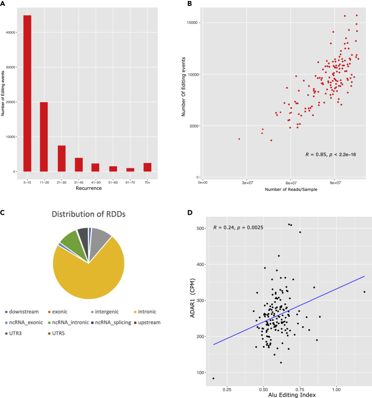
Figure 2.
Distribution of RDDs and association between AEI and ADAR1
(A) TCGA AML RDDs were categorized into groups based on their recurrence. Intervals on x axis represent the number of samples in each group. Number of RDDs is shown on the y axis.
(B) Correlation between number of RDDs (y axis) in each sample and number of reads per sample (x axis). Spearman correlation and p value are shown.
(C) Genomic locations of RDDs quantified in the AML dataset. As described in Annovar, “upstream” and “downstream” are defined as within 1-kb from the transcription start and end site, respectively.
(D) Correlation plot between AEI and ADAR1 gene expression (CPM). Each dot represents an AML patient sample. The straight blue line represents the linear relationship between the AEI and ADAR1 expression.

