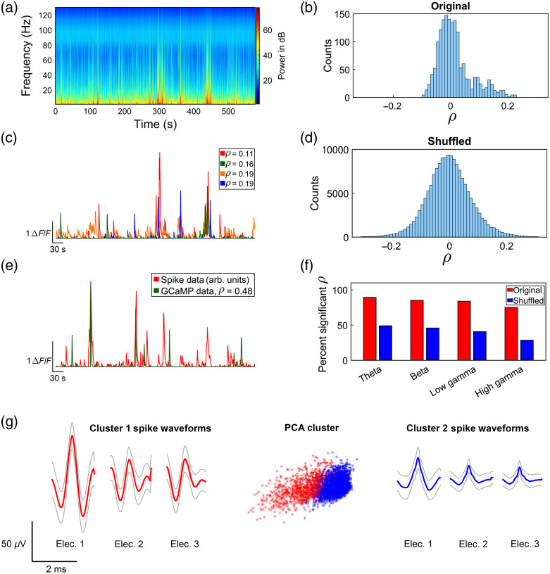
Fig. 4.
GCaMP versus electrical data cross-correlation results analyzing data in Fig. 3(b). (a) Mean LFP power spectrogram of all 16 electrodes during a 10-min timelapse. (b) Histogram of Pearson linear correlation coefficients between all 100 GCaMP cells and all 16 electrodes for the theta bandwidth, showing a skew towards positive correlations. (c) CaImAn-processed traces of the four optically recorded cells with highest correlation coefficients to the theta bandwidth LFP data. The legend reports the average for that GCaMP trace across all 16 electrodes. (d) Histogram of Pearson linear correlation coefficients between shuffled GCaMP cells and all 16 electrodes for the theta bandwidth, showing a more normal distribution than the original, nonshuffled cross-correlation analysis histogram. (e) Cross-correlation analysis results between CaImAn-processed GCaMP data and convolved spike data using Fig. 3(b) data. Binary spike data were convolved with an exponential decay function using the same decay constant used in CaImAn analysis to approximate what the activity of these spiking cells would look like as GCaMP signal. We then used Pearson’s linear correlation coefficient to find the optically recorded cells, which matches the processed spike data most closely. Here, we are showing the result with the highest correlation coefficient, . The units of the spike data are arbitrary, so we have scaled the spike data trace to be of similar amplitude to the GCaMP trace. (f) Bar chart showing per bandwidth percentage of significant correlations for Pearson correlation coefficient analysis for original and shuffled datasets. (g) Spike waveform and PCA cluster results from spike sorting on the tetrode, which yielded the highest correlation single unit shown in panel (e), shown in red. Gray traces show ± standard deviation of the waveform. The fourth electrode was used as a reference and hence did not yield a waveform.

