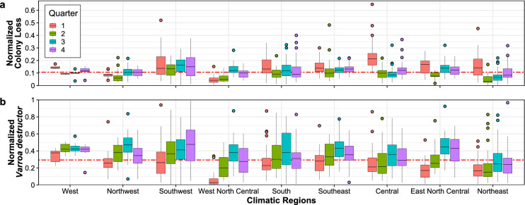
Figure 2.
Empirical distribution of honey bee (Apis mellifera) colony loss (a) and Varroa destructor presence (b) across quarters (the first one being January-March) and climatic regions; red dashed lines indicate the overall medians. (a) Box plots of normalized colony loss (number of lost colonies over the maximum number of colonies) for each quarter of 2015–2021 and each climatic region. At the contiguous United States level, this follows a stable pattern across the years, with higher and more variable losses during the first quarter (see Supplementary Figs. S2-S6), but some regions do depart from this pattern (e.g., West North Central). (b) Box plots of normalized V. destructor presence (number of colonies affected by V. destructor over the maximum number of colonies) for each quarter of 2015–2021 and each climatic region. The maximum number of colonies is defined as the number of colonies at the beginning of a quarter, plus all colonies moved into that region during the same quarter.

