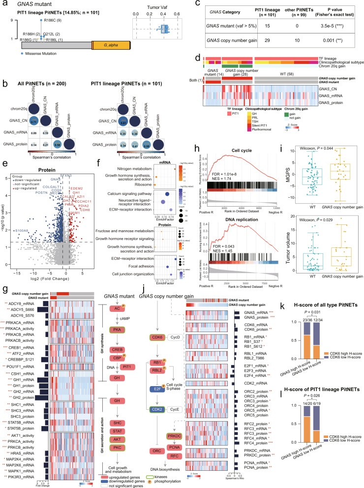
Fig. 3. Impact of GNAS mutation and GNAS copy number gain in the PIT1 lineage.
a Lollipop plot and boxplot showing the position and tumor VAF of the GNAS mutation in the PIT1 lineage. b Spearman’s correlation of chromosome 20q and the copy number, mRNA expression and protein abundance of GNAS in all PitNET samples and PIT1 lineage samples. Spearman’s correlation, *P < 0.05, **P < 0.01, ***P < 0.001. c Distribution of GNAS altered samples in different categories among the PIT1 lineage and other lineages (Fisher’s exact test, **P < 0.01, ***P < 0.001). d Heatmap visualizing multi-omics profiles of the levels of GNAS copy number, mRNA expression and protein abundance. e Volcano plots displaying the differentially expressed proteins in GNAS mutant and GNAS WT patients after applying a two-fold change in expression with P < 0.05 (Wilcoxon rank-sum test). Proteins significantly enriched in the GNAS mutant and GNAS WT patients are represented as red/blue-filled dots. f Pathways enriched for the differentially expressed mRNAs and proteins. Pathways that were significantly upregulated/downregulated in the GNAS mutants are represented as red/blue-filled dots. g Heatmap of multi-omics features of GH secretion-related genes. The pathway diagram on the right depicts how the features included in the heatmap regulate GH synthesis, secretion and activity. Red boxes indicate upregulated genes and blue boxes indicate downregulated genes. Green rectangles indicate kinases and orange circles indicate phosphorylated proteins. Bar chart next to the heatmap shows the fold changes of GNAS mutant/WT (*P < 0.05, **P < 0.01, ***P < 0.001). h GSEA plots for proliferation-related pathways based on the rank of GNAS copy number-mRNA (bottom) or protein (upper) abundance correlations. i Boxplots showing the difference of MGPS and tumor volume between WT and GNAS copy number gain group. The significance was calculated by Wilcoxon test. j Heatmap of multi-omics features of proliferation-related genes. The pathway diagram on the left depicts how the features included in the heatmap regulate cell cycle S-phase and DNA biosynthesis. Red boxes indicate upregulated genes and blue boxes indicate downregulated genes. Green rectangles indicate kinases and orange circles indicate phosphorylated protein. Bar chart next to the heatmap shows the Spearman’s correlation coefficient between GNAS copy number and proliferation-related genes (*P < 0.05, **P < 0.01, ***P < 0.001). k, l Bar plots showing the proportion of CDK6 high H-score cells between GNAS high H-score group and GNAS low H-score group in all PitNETs and PIT1 lineage PitNETs. The significance was calculated by Fisher’s exact test.

