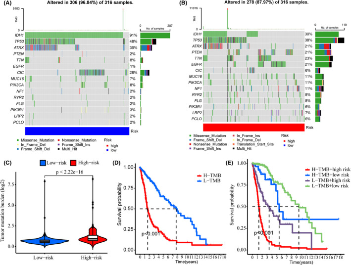
FIGURE 6.

TMB analysis. (A, B) Waterfall plots showing the top 15 genes with the highest alteration frequencies of the low‐ (A) and high‐risk (B) groups. (C) TMB scores of the low‐ and high‐risk groups. (D) Kaplan–Meier analysis showing the overall survival of low‐ and high‐TMB groups. (E) Kaplan–Meier analysis showing the overall survival of low‐ and high‐risk subgroups in low‐ and high‐TMB groups, respectively.
