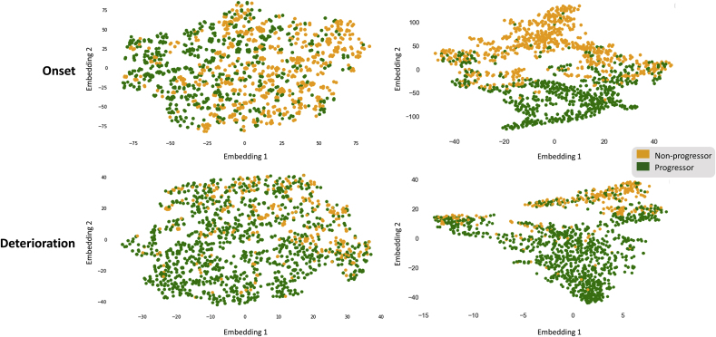
Fig. 3.
The t-SNE clustering visualization. The upper panel corresponds to the onset KOA progression, the lower panel shows the data distribution of the pre-existing KOA progression. The two plots on the left reveal the distribution of the data before being processed by the MLP, whereas the plots on the right-hand side visualize the distribution of data after projection by the MLP.

