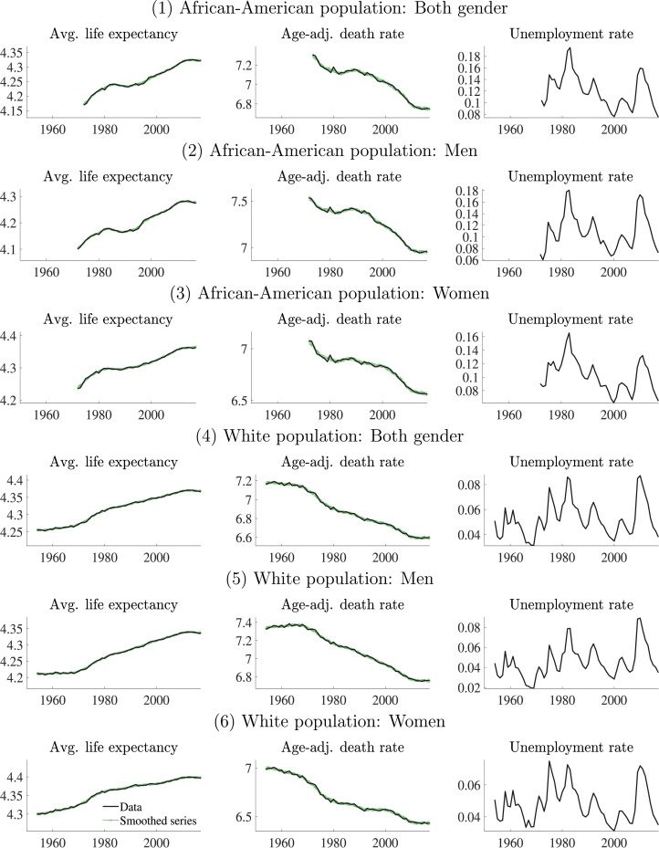
Fig. E.2.
Data by race and gender. Notes: This figure presents the log average life expectancy (first column), the log age-adjusted death rate (second column), and the unemployment rate (third column) for the overall US population. The original series are presented in black solid lines. For the first two series, we compare with the smoothed estimates from our model (green lines). The data span from 1954 to 2017 for the White population, and from 1972 to 2017 for the African-American population. (For interpretation of the references to colour in this figure legend, the reader is referred to the web version of this article.)

