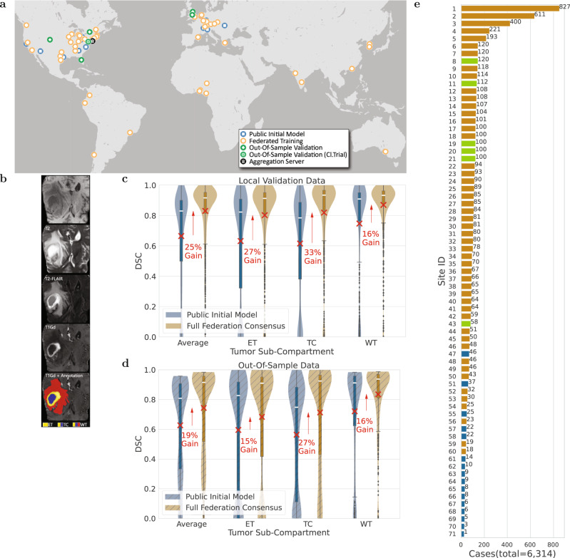
Fig. 1. Representation of the study’s global scale, diversity, and complexity.
a The map of all sites involved in the development of FL consensus model. b Example of a glioblastoma mpMRI scan with corresponding reference annotations of the tumor sub-compartments (ET enhancing tumor, TC tumor core, WT whole tumor). c, d Comparative Dice similarity coefficient (DSC) performance evaluation of the final consensus model with the public initial model on the collaborators' local validation data (in c with n = 1043 biologically independent cases) and on the complete out-of-sample data (in d with n = 518 biologically independent cases), per tumor sub-compartment (ET enhancing tumor, TC tumor core, WT whole tumor). Note the box and whiskers inside each violin plot represent the true min and max values. The top and bottom of each “box” depict the 3rd and 1st quartile of each measure. The white line and the red ‘×’, within each box, indicate the median and mean values, respectively. The fact that these are not necessarily at the center of each box indicates the skewness of the distribution over different cases. The “whiskers” drawn above and below each box depict the extremal observations still within 1.5 times the interquartile range, above the 3rd or below the 1st quartile. Equivalent plots for the Jaccard similarity coefficient (JSC) can be observed in supplementary figures. e Number of contributed cases per collaborating site.

