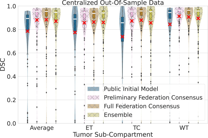
Fig. 2. Generalizable Dice similarity coefficient (DSC) evaluation on ‘centralized’ out-of-sample data (n = 154 biologically independent cases), per tumor sub-compartment (ET enhancing tumor, TC tumor core, WT whole tumor) and averaged across cases.
Comparative performance evaluation across the public initial model, the preliminary consensus model, the final consensus model, and an ensemble of single site models from collaborators holding > 200 cases. Note the box and whiskers inside each violin plot, represent the true min and max values. The top and bottom of each “box” depict the 3rd and 1st quartile of each measure. The white line and the red ‘×’, within each box, indicate the median and mean values, respectively. The fact that these are not necessarily at the center of each box indicates the skewness of the distribution over different cases. The "whiskers'' drawn above and below each box depict the extremal observations still within 1.5 times the interquartile range, above the 3rd or below the 1st quartile. Equivalent plots for Jaccard similarity coefficient (JSC) can be observed in supplementary figures.

