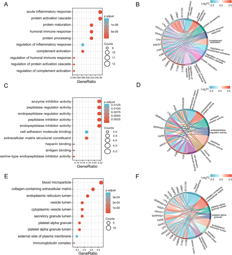
Fig. 5.
GO analysis of DEPs in the sEVs from patients with HCC. A Bubble diagram of the GO functional enrichment analysis of the biological process category. B Chord plot of the GO functional enrichment analysis of the biological process category. C Bubble diagram of the GO functional enrichment analysis of the molecular function category. D Chord plot of the GO functional enrichment analysis of the molecular function category. E Bubble diagram of the GO functional enrichment analysis of the cellular component category. F Chord plot of the GO functional enrichment analysis of the cellular component category. On the horizontal axis of the bubble diagram, the gene ratio is the ratio of the observed protein count to the background protein count. The color gradient in the bubble diagram represents the adjusted p value (-log10), and the size of bubbles represents the number of enriched proteins. DEPs are listed on the left of the chord plot and connected to the GO terms. The fold change (Log2) is represented by the color indicated in the color bar. The color on the right of the chord plot represents each GO term

