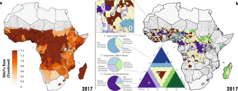
Fig. 2. Combined disability-adjusted life years (DALYs) in 2017 and decomposition.
a Second administrative level estimates of combined DALYs. b For second administrative units where the combined DALYs per child per year exceeded 0.5 in 2017, the primary component of the local composition of burden is plotted. Units where the combined DALYs were less than 0.5 are plotted as white. Units with dark purple have greater than 60% of their combined burden attributable to malaria (e.g., areas of Burkina Faso). Units with dark blue have greater than 60% of their combined burden attributable to LRIs (e.g., areas of Nigeria). Units with dark green have greater than 60% of their combined burden attributable to diarrhoea (e.g., areas of Chad). Units coloured light purple, blue, or green have between 50% and 60% of their combined burden attributable to malaria, LRIs, or diarrhoea, respectively. Units coloured yellow have no dominant cause (no cause’s contribution exceeds 50%). Units which are shaded dark brown have all causes represented in their combined burden with percentages between 20% and 40%. Three examples from Western sub-Saharan Africa are highlighted. For each region, the composition of the relative contribution of each cause translates to a point in the ternary plot legend. The closer a point is to each corner, the higher the relative contribution of that cause. Maps were produced using ArcGIS Desktop 10.6.

