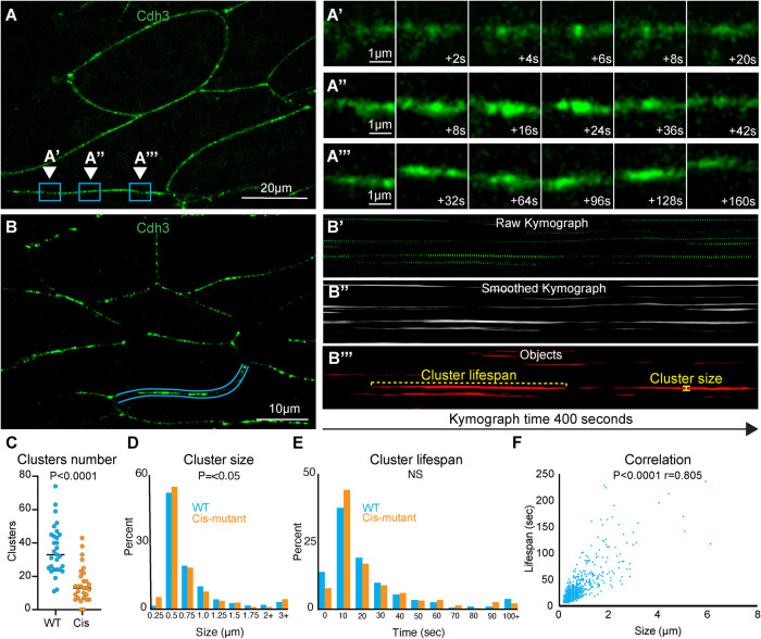
FIGURE 3:
Cadherin clusters display heterogeneous spatiotemporal dynamics during CE. (A) Still frame from a superresolution time-lapse movie of Cdh3. Three different regions of a single junction are highlighted; each region is the position where a cluster formed and dissipated. These regions were chosen to highlife the heterogeneity in cluster size and lifespan. (A′) Frames from the time-lapse movie shown in A with a zoom on the inset labeled A′. These images show a small, short lifespan Cdh3 cluster. (A′′) Frames from the time-lapse movie shown in A with a zoom on the inset labeled A′′. Images show a large cluster with an intermediate lifespan. (A′′′) Frames from the time-lapse movie shown in A with a zoom on the inset labeled A′′′. Images show a particularly long-lived Cdh3 cluster. (B) Still frame from a time-lapse superresolution movie of Cdh3. Here the blue lines highlight the cell junction that was used to make the kymographs in B′–B′′′. (B′) The raw kymograph of the cell junction highlighted in B. This kymograph shows Cdh3 over a 400 s time period beginning at the left side of the image. (B′′) Smoothed image of the kymograph shown in B′. This kymograph was smoothed along the time axis to connect the Cdh3 spots into uninterrupted clusters. (B′′′) This image shows a thresholded version of the kymograph in B′′. Here the kymograph was thresholded and converted to a binary image that allowed us to identify clusters as individual objects. Objects that touched the edges of the kymograph were removed so that we evaluated only complete clusters. The cluster lifespan was then determined as the cluster length, and the cluster size was determined by the width of each cluster. (C) Graph showing the number of clusters per junction for control and Cdh3-cis-mutant junctions. Each spot represents a single junction, and all junctions were measured over a 400 s time frame. Conditions were statistically compared using a Mann–Whitney test. (D) Histogram displaying the size distribution of control and Cdh3-cis-mutant clusters. Conditions were statistically compared using a Kolmogorov–Smirnov test. (E) Histogram displaying the Cdh3 cluster lifespan distribution for control and Cdh3-cis-mutant clusters. Conditions were statistically compared using a Kolmogorov–Smirnov test. (F) Graph plotting Cdh3 cluster size vs. cluster lifespan from control embryos. Each dot represents a single cluster, and the relationship between size and lifespan was assessed with a Spearman correlation.

