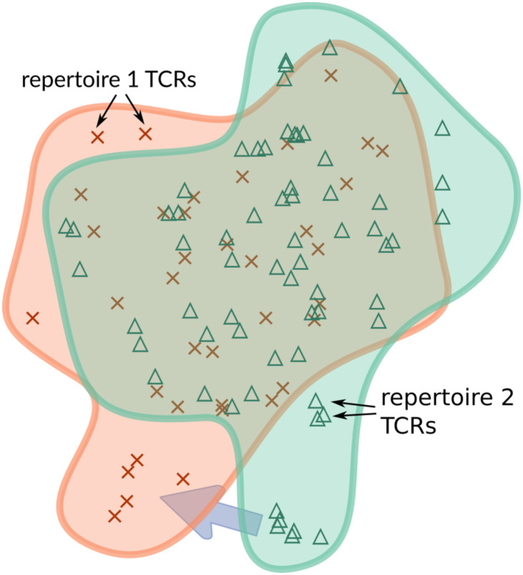
Fig 1. A schematic of TCR distribution comparison.
Each symbol represents a TCR in an abstract space in which distance is defined via TCRdist [30], and the two regions represent two population repertoires of interest. Each repertoire is given its own color (here orange and green). The purple arrow shows that there are regions of these TCR distributions for the green repertoire that do not have a close equivalent in the orange repertoire, which will be identified by our optimal transport methods.

