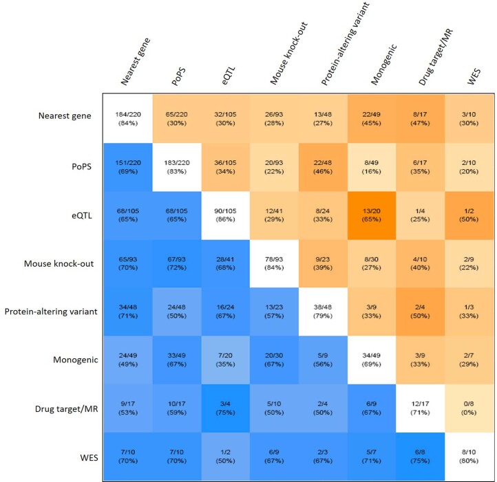
Extended Data Fig. 6. Pairwise concordance of eight gene-prioritization predictors to identify most likely causal genes.
White squares lying on the diagonal contain the number of genes for which that predictor provided evidence (denominator) and the number of times for which that predictor prioritized the most likely causal gene at the locus (numerator). For example, eQTL data provided evidence for 105 causal genes, of which 90 (86%) were also the most likely causal gene at the locus. Blue squares below the diagonal show the concordance between pairs of predictors and contain the number of genes for which both predictors provided evidence (denominator) and the number of times for which the prioritized causal gene was the same (numerator). For example, the nearest gene and the presence of a protein-altering variant in high LD (r2 > 0.8) with the CAD sentinel both provided evidence for a causal gene at 48 loci, of which they were concordant (that is prioritized the same causal gene) at 34 (71%). Darker blue squares show higher levels of concordance. Orange squares above the diagonal show the discordance between pairs of predictors and contain the number of genes for which both predictors provided evidence (denominator) and the number of times for which the prioritized causal gene was the different (numerator). For example, the nearest gene and the presence of a protein-altering variant in high LD (r2 > 0.8) with the CAD sentinel both provided evidence for a causal gene at 48 loci, of which they were discordant (that is prioritized a different causal gene) at 13 (27%). Darker orange squares show higher levels of discordance. See Fig. 5a for descriptions of the eight predictors used to prioritize causal genes.

