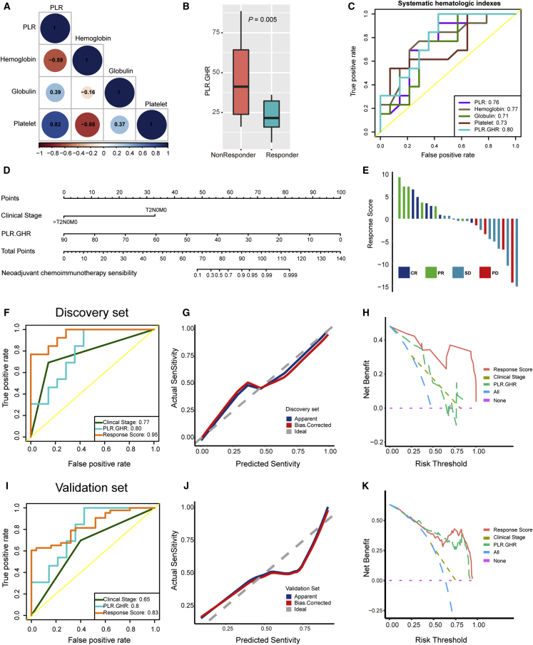
Figure 2.
Developing and validating the pathological response prediction nomogram in the NAC.NICB cohort
(A) The spearman correlations between four hematological indicators during the discovery stage. Brown color represents negative correlation, while blue color represents positive correlation. PLR: platelet-to-lymphocyte ratio.
(B) The PLR.GHR level in responders and non-responders during the discovery stage.
(C) Receiver operating characteristic (ROC) curves of five hematological indicators for predicting pathological response during the discovery stage.
(D) The pathological response prediction nomogram during the discovery stage.
(E) Bar plots show the distribution of response scores calculated by the nomogram in different response groups during the discovery stage.
(F) ROC curves of clinical stage, PLR.GHR, and response scores for predicting pathological response during the discovery stage.
(G) The calibration curves show that the predicted response sensitivity was consistent with the actual sensitivity during the discovery stage.
(H) The decision curves highlight the highest net benefit of response score compared with clinical stage and PLR.GHR during the discovery stage.
(I) ROC curves of clinical stage, PLR.GHR, and response score for predicting pathological response during the validation stage.
(J) The calibration curves show that the predicted response sensitivity was consistent with the actual sensitivity during the validation stage.
(K) The decision curves highlight the highest net benefit of response score compared with clinical stage and PLR.GHR during the validation stage.

