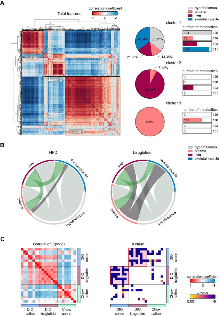
Figure 7.
Liraglutide rewires correlations of randomized metabolites. A, correlation plot of randomized total metabolites based on Pearson’s correlation coefficients. The percentages of tissue-specific metabolites belonging to clusters 1 to 3 are shown as pie charts. For each cluster, the numbers of metabolites in plasma and each tissue are shown as bar graphs; the total numbers of metabolites detected are shown on the right side of the bar graphs. B, mapping of intertissue metabolite correlations. Ribbons connecting metabolite intertissue classes indicate significant correlations between metabolites. Ribbon thickness indicates the number of significantly correlated metabolites. C, plots of intergroup correlations and p values. Pink background in the p value plot indicates the most significant group between the paired groups.

