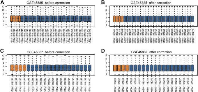
FIGURE 2.
Box plots of gene expression data before and after normalization. (A) GSE45885 before correction, (B) GSE45885 after correction, (C) GSE45887 before correction, (D) GSE45887 after correction. The x-axis label represents the sample symbol and the y-axis label represents the gene expression values. The orange bar represents the data of normal control samples and the blue bar represents the data of NOA samples.

