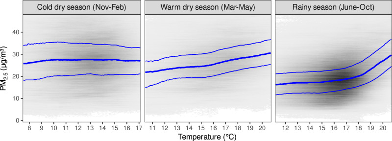
Fig. 3. Heatmaps of mean temperature and mean PM2.5, counting all grid cells and days equally.
Darker areas indicate more grid cells, more days, or both. Temperature and PM2.5 predictions are already rounded to the nearest tenth, so no further grouping is needed for a heatmap. For legibility, the temperature scale only shows the middle 95% of the data for each season, and the PM2.5 scale only goes up to the 98th percentile for all seasons. Blue lines show the quartiles of PM2.5 conditional on temperature.

