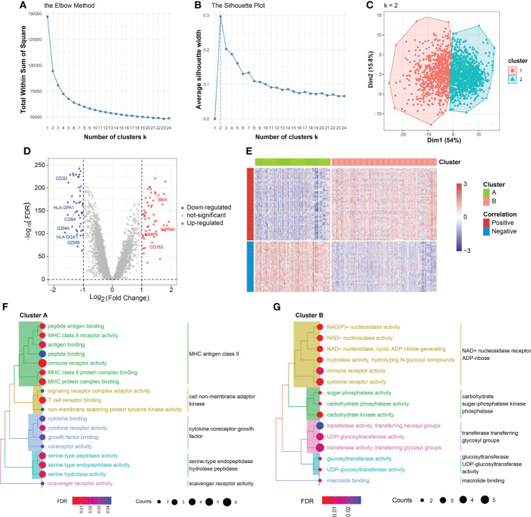
Figure 3.
K-means clustering analysis and cluster annotation. (A) Total within sum of square (WSS) plotted against the number of clusters. The WSS dropped rapidly from 1 to 2 classes and slowly after k = 2. (B) Average silhouette width plotted against the number of clusters, demonstrating the 2-subclass was the ideal choice. (C) Scatter plot of distribution of sepsis samples in the two principal dimensions. (D) Volcano plot of DEGs of cluster B vs. cluster A. (E) Heatmap of DEGs between cluster A and cluster B. The expression values were normalized from -3 to 3. Color red represents relatively increased expression and color blue represents relatively deceased expression. (F) Gene Ontology (GO) analysis on DEGs overexpressed in cluster A. (G) Gene Ontology (GO) analysis on DEGs overexpressed in cluster B.

