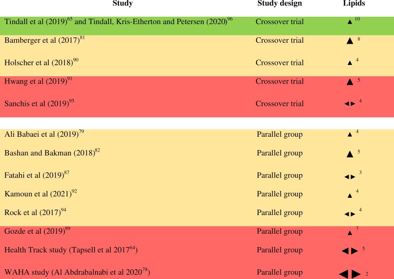
Figure 2.
Effect direction plot for blood lipids, presented by study design. Effect direction: Upward arrow  = positive health impact, downward arrow
  = negative health impact, sideways arrow
  = no change/mixed effects/conflicting findings. Final sample size (individuals) in intervention group: large arrow
  indicates >300; medium arrow
  indicates 50–300; small arrow
  indicates <50. Study quality, denoted by row color: green = low risk of bias; amber = some concerns; red = high risk of bias. The numbers in superscript in column 1 denote the reference numbers, and the numbers in superscript in column 3 denote the number of outcomes that contributed to the effect direction (if >1). A color version of this figure appears in the online version of this article.

