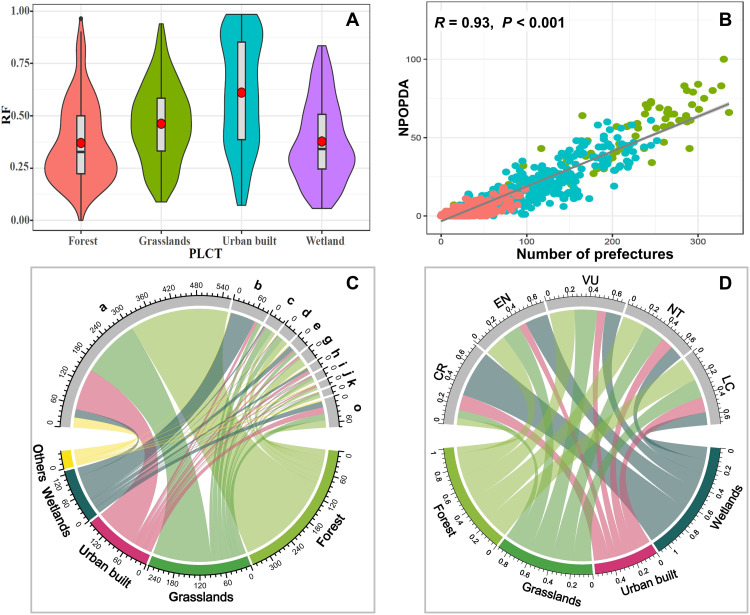
Fig. 4. The impact of urbanization on RF.
(A) The preferred land cover types (PLCTs) of individual bird species divided into four types: forest, grassland, urban built-up land, and wetland. The shapes present the distribution of RF. The red dots in (A) represent the average RF value. Birds usually have a smaller RF if their PLCT is forest or wetland. Birds that can adapt to the urban environment have the largest mean RF, indicating that they are less affected by human activities. (B) Each dot represents a bird species. The horizontal axis represents the number of prefectures where the bird species are currently found (number of prefectures). The vertical axis represents the number of prefectures outside the potential distribution area (NPOPDA). Green dots indicate that the bird’s range is expanding, which accounted for 7.24%. The red dots indicate that disappearance from the potential distribution is larger than NPOPDA, and the area is shrinking. Human activities have opposite effects on the distribution of widespread and narrow-range birds. (C) Bird’s PLCT for different order. Numbers represent the number of species. (a) Passeriformes, (b) Charadriiformes, (c) Accipitriformes, (d) Galliformes, (e) Anseriformes, (g) Piciformes, (h) Pelecaniformes, (i) Columbiformes, (j) Coraciiformes, (k) Strigiformes, and (o) others. (D) Bird’s PLCT for different Red List categories. Numbers represent the preference of each category of birds for different PLCTs.

