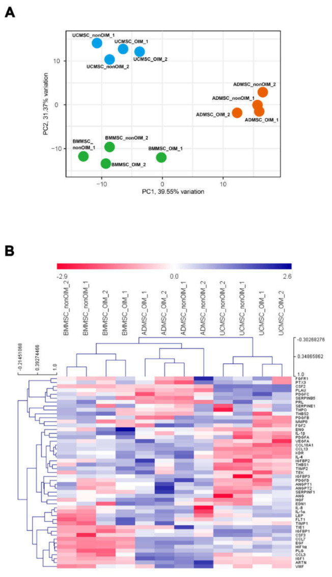
Figure 4.
Data visualization of DCt values after qPCR. (A) A principal component analysis (PCA) of DCt values. The PCA plot was from the viewpoint of the samples, and variances of PC1 and PC2 were 39.55% and 31.37%, respectively. (B) A hierarchical clustering (HCL) of genes and samples. Red and blue colors represented higher and lower expression levels of genes, respectively. DCt values were normalized using GAPDH as a reference gene.

