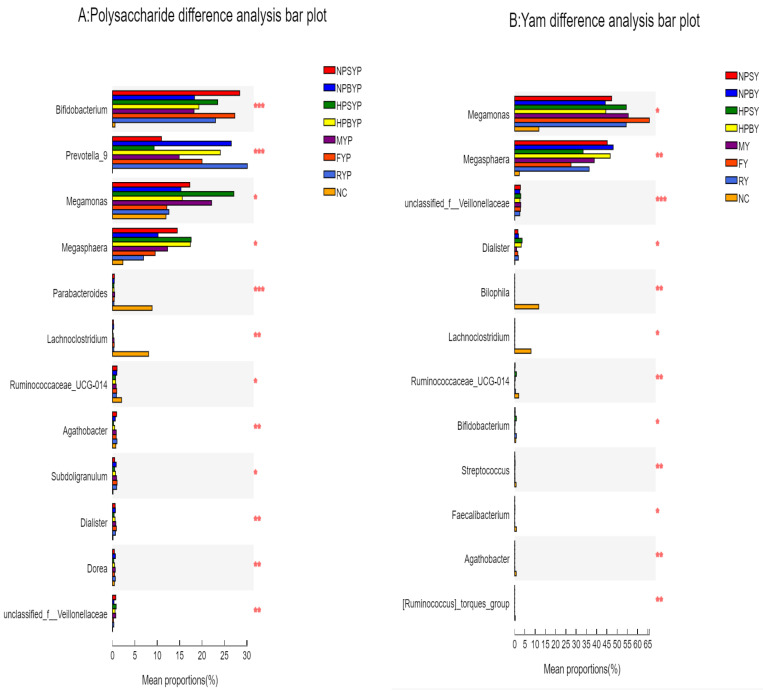
Figure 2.
Bar chart of multi-species difference test. Note: A = Polysaccharide difference analysis bar plot, B = Yam difference analysis bar plot. The Y axis represents the species name at a taxonomic level, the X axis represents the average relative abundance in different groups of species, and the columns with different colors represent different groups. The rightmost side shows the p value, * 0.01 < p ≤ 0.05, ** 0.001 < p ≤ 0.01, *** p ≤ 0.001. NC = blank, NPSY = Normal-pressure steamed yam, NPBY = Normal-pressure boiled yam, HPSY = High-pressure steamed yam, HPBY = High-pressure boiled yam, MY = Microwaved yam, FY = Stir-fried yam. RY = Raw yam. NPSYP = Normal-pressure steamed yam polysaccharide, NPBYP = Normal-pressure boiled yam polysaccharide, HPSYP = High-pressure steamed yam polysaccharide, HPBYP = High-pressure boiled yam polysaccharide, MYP = Microwaved yam polysaccharide, FYP = Stir-fried yam polysaccharide, RYP = Raw yam polysaccharide.

