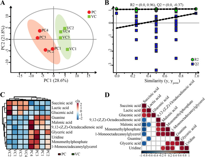
Fig. 4.
Differential analysis of intestinal metabolites between the control and vaccinated groups: A partial least squares-discriminant analysis (PLS-DA), B permutations plot of metabolome data processing, C clustering heatmap analysis of differential metabolites, D the heatmap showing the association of differential metabolites. The correlation coefficient is represented by different colors: orange-red represents positive correlation (p < 0.05), blue-green represents negative correlation (p < 0.05). The larger circle represents the greater correlation coefficient

