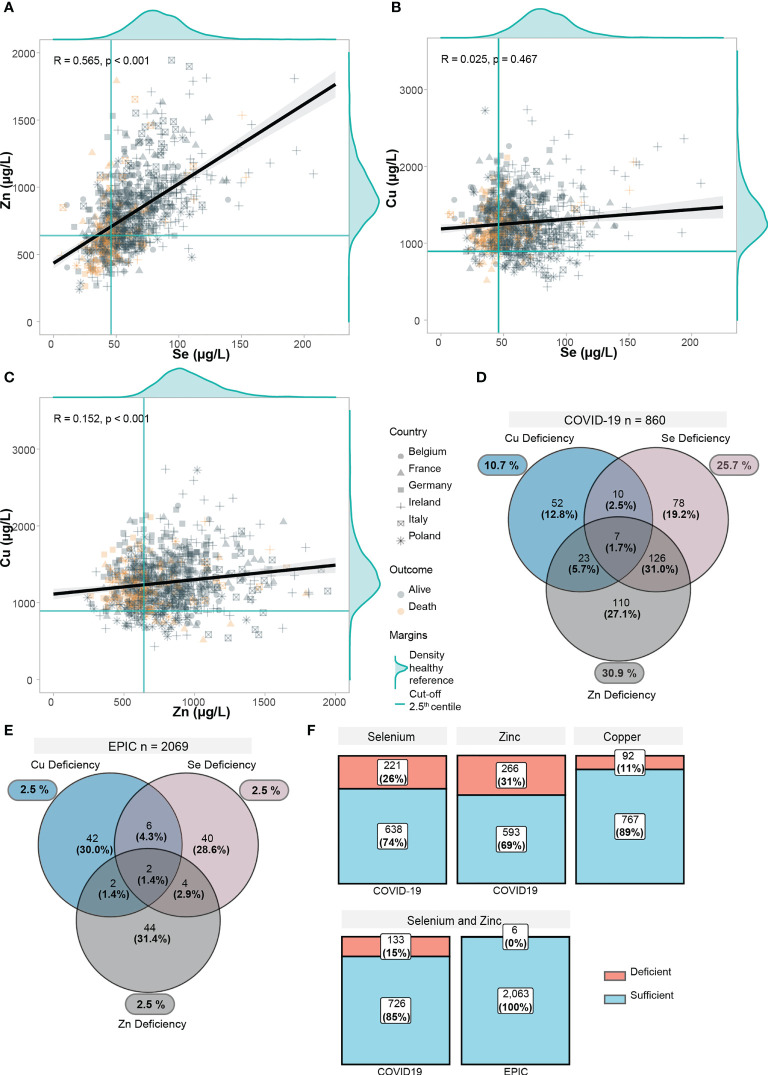
Figure 2.
Trace element status in relation to each other and EPIC-reference cohort. (A–C) Scatter plots displaying the correlation between trace elements in COVID-19 positive patients. Yellow points display deceased patients, grey points display alive patients. Point shapes differ according to each country. For each trace element, the distribution of the healthy EPIC-cohort (n=2069) was plotted as marginal density plots. Green lines correspond to the 2.5th lowest centile in the EPIC-cohort. Black line is computed using linear regression, gray shadows correspond to 95% confidence intervals. Correlation coefficient (R) was computed with the Spearman’s R. (D) Deficiencies in trace elements (below 2.5th centile in EPIC) are shown. Venn diagram shows overlapping/combined deficiencies. (E) Deficiencies in trace elements are shown in the EPIC cohort. (F) Proportions of deficiency in each trace element as well as a combined Se and Zn deficiency are displayed.

