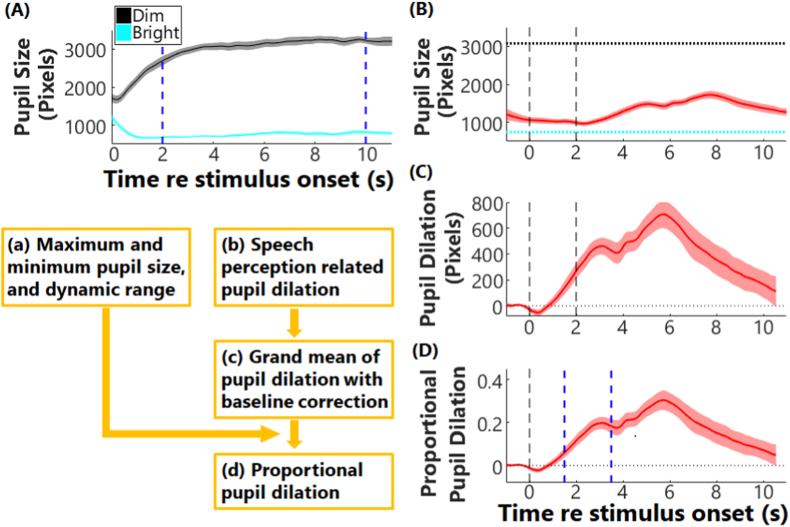
Fig. 2.
Diagram of pupillometry data analysis. Panel (A) shows the pupil dilation to dim (black) and bright light (cyan). Solid lines and areas are for the grand means and standard error of the means (SEM). The two blue vertical dash lines plot the time window (2–10 s) that the pupil sizes were averaged to calculate the maximum and minimum of pupil sizes in response to light, i.e., dynamic range. Panel (B) plots an example of pupillometry response (mean ± SEM) in a speech perception task, with two black vertical dash lines showing the onset and offset of the speech stimulus. The black and cyan lines are the calculated maximum and minimum of pupil sizes in response to light, respectively, as shown in panel (a). Panel (C) plots the pupil dilation after baseline subtraction. Panel (D) plots the proportional pupil dilation relative to the dynamic range of pupil sizes. The two blue vertical dash lines plot the time window that the maximum of pupil dilation was identified. (For interpretation of the references to color in this figure legend, the reader is referred to the Web version of this article.)

