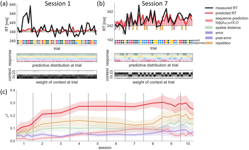
Fig 6. Trial-by-trial predictive check.
In (a) and (b) we show example segments of held-out data from session 1 and 7 of participant 102 (Top) Colored bars show the positive (slowing) and negative (speeding) effects predicted by the different components in our model relative to the intercept (horizontal black line). The overall predicted RT value (red line) is the sum of all effects. The color code of the event and the response are shown on the bottom. A mismatch between the two indicates an error. (Middle) Predictive probabilities of the four responses are shown for each trial. The cells’ hue indicate the response identity, saturation indicates probability value. The sequence prediction effect (pale red bar in (Top)) is inversely proportional to the probability of the response, i.e. higher probability yields faster response. The ticks at the bottom indicate high-probability trigram trials. (Bottom) We show what proportion of the predictive probability comes from each context length. Higher saturation indicates a larger weight for a context length. (c) Test prediction performance of the full model and each model component in terms of unique variance explained, averaged across participants. Bands represent the 95% CI.

