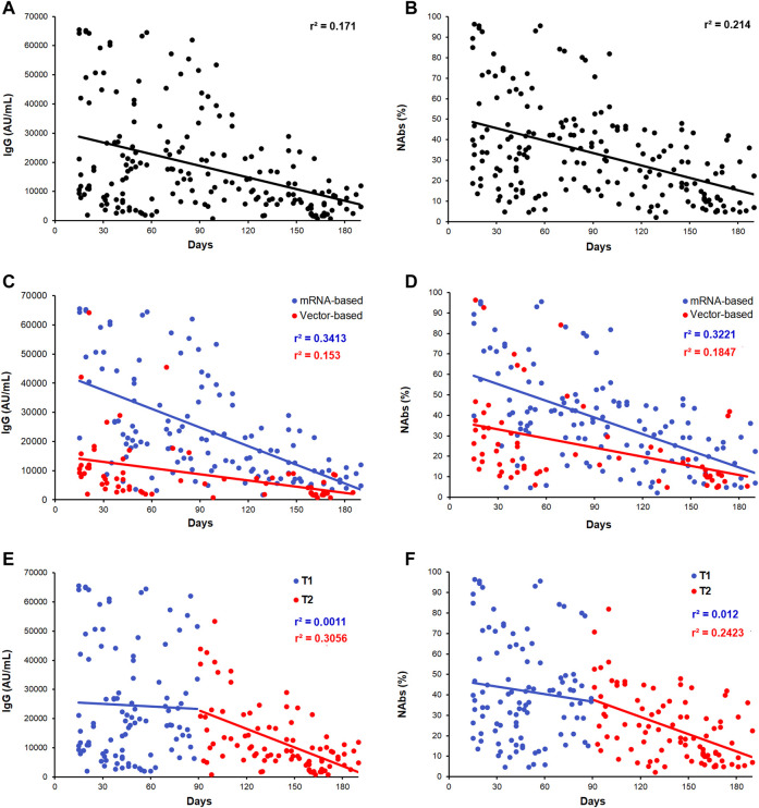
FIGURE 1.
Scatter plots of the distribution of antibody levels after second dose of vaccine. (A,B) IgG and NAbs kinetic distributions in the whole cohort of subjects. (C,D) IgG and NAbs distribution stratified by the vaccine type (mRNA-based vaccine: blue dots/line and vector-based vaccine: red dots/line). (E,F) IgG and NAbs distribution, respectively, stratified by T1 and T2 recruitment time (T1: blue dots/line and T2: red dots/line). Each panel shows the specific regression line and the r-coefficient.

