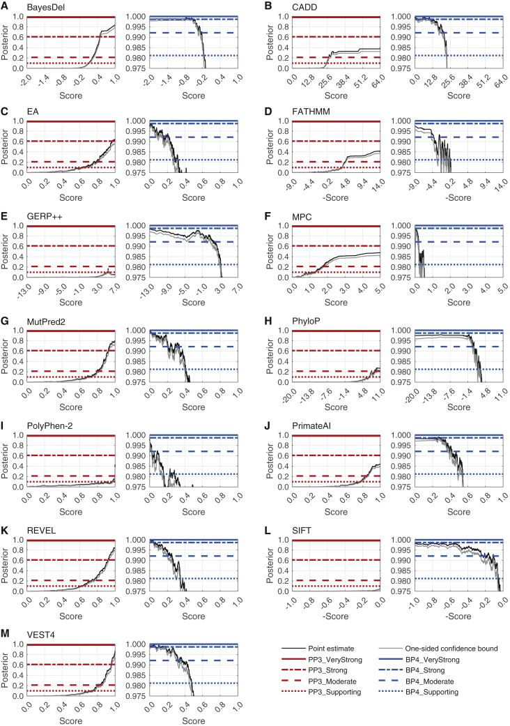
Figure 3.
Local posterior probability curves
Shown are (A) BayesDel, (B) CADD, (C) Evolutionary Action (EA), (D) FATHMM, (E) GERP++, (F) MPC, (G) MutPred2, (H) PhyloP, (I) PolyPhen-2, (J) PrimateAI, (K) REVEL, (L) SIFT, and (M) VEST4. For each panel, there are two curves: the curve on the left is for pathogenicity (red horizontal lines) and the curve on the right is for benignity (blue horizontal lines). The horizontal lines represent the posterior probability thresholds for supporting, moderate, strong, and very strong evidence. The black curves represent the posterior probability estimated from the ClinVar 2019 set. The grey curves represent one-sided 95% confidence intervals calculated from 10,000 bootstrap samples of this data set (in the direction of more stringent thresholds). The points at which the grey curves intersect the horizontal lines represent the thresholds for the relevant intervals.

