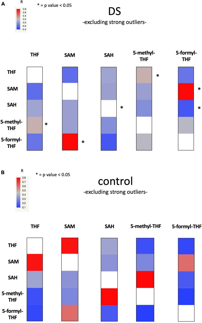
FIGURE 3.
Heat Map figure of bivariate correlation between levels of each metabolite and levels of all the other metabolites excluding strong outliers. (A) presents bivariate correlations in DS group and (B) presents bivariate correlation in the control group (for complete data see Supplementary Table 11). At the top left of the figures the color code bar for Pearson correlation coefficient (r). Statistically significant correlations were marked with an “*”.

