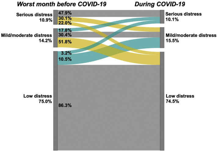
Fig. 1.
Individual Change in Psychological Distress during the COVID-19 Pandemic, American Life Panel, N = 1870 Percents outside the bars represent population prevalence at each time point. Percents within the bars represent the proportions at each level of distress at T1 who transitioned to each level of distress at T2; these proportions are also reflected in the width of the bars. Turquoise bards indicate increases in distress, yellow bars indicate decreases in distress and grey bars indicate no change. Psychological distress assessed with the Kessler-6, with categorization as defined in the text. The pre-COVID-19 assessment was conducted in February 2019 and referred to the worst month of the past year. The COVID-19 assessment was conducted in May 2020 and referred to the past 30 days. (For interpretation of the references to colour in this figure legend, the reader is referred to the web version of this article.)

