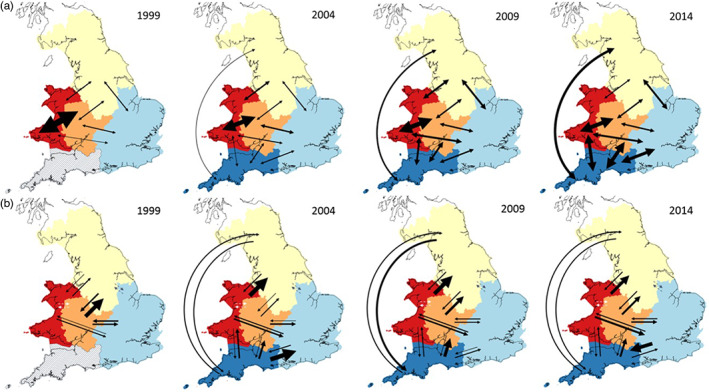
FIGURE 4.

Gene flow between RBD regions at each of four time points (1999–2014). (a) Gene flow estimates from the private alleles method with arrows showing the migration between pairs of RBD regions and the arrow weight being directly proportional to the number of effectively migrating individuals. (b) Directional gene flow estimates from BayesAss with arrows showing the direction of effective migration and where arrow weight is directly proportional to percentage migration between populations. White and grey dashed arrows show regions where pairwise migration rates could not be reliably inferred due to low genetic differentiation. Regions are coloured as follows: Western Wales—red; Severn—orange; northern—yellow; eastern—light blue; South West—dark blue. Hatched lines indicate that a region was not included in the analysis at that time point.
