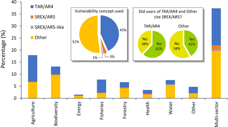
Fig. 3.
Climate-related vulnerability assessments (January 2017–December 2020). The stacked column graph shows the distribution of vulnerability studies (n = 464) across sectors subdivided according to the vulnerability concept used. The inset pie chart on the left summarizes the proportion of studies that adopted and/or implemented the vulnerability concepts. The inset pie charts on the right show the proportion of studies that adopted and/or implemented the TAR/AR4 and other vulnerability concepts and that cited or did not cite the SREX/AR5 vulnerability concept. See Table 1 for details

