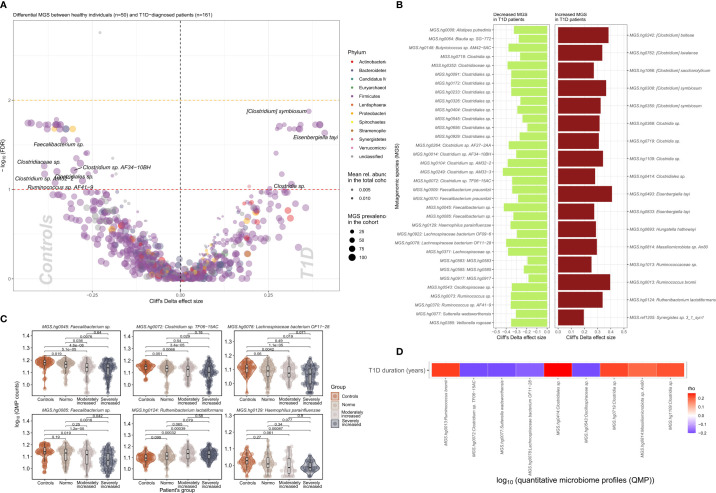
Figure 2.
Differential bacterial abundance at metagenomic species (MGS) level, between T1D and healthy individuals. (A) Volcano plot showing difference in absolute abundance of metagenomic species (MGS) between T1D individuals (n=161) and the healthy controls (n=50). X-axis indicates Cliff’s Delta effect size; Y-axis represents FDR-corrected (negative log) p–values. MGS that associated positively with T1D have been depicted towards increasing direction of effects (right). MGS circle color depicts the corresponding annotated phylum. Circle size corresponds to the number of individuals in the cohort where the specific MGS was found. Transparency of the circle corresponds to the average relative abundance in which each MGS is found within participants. (B) Significant contrasts in MGS abundance between T1D and healthy controls depicted with the bar length corresponding to Cliff’s Delta effect size: green for higher and red for lower MGS abundances within T1D individuals. (C) Differential absolute MGS abundance between T1D subgroups stratified on levels of albuminuria. Individual distribution of the log10 transformed QMP counts (absolute abundance) is depicted for each MGS in violin and dot plots. Global distribution of the MGS counts for each T1D subgroup is depicted with a boxplot, indicating median value of the distribution with a horizontal line, first and third quartile with the limits of the white rectangle and the upper and lower limits of the distribution with vertical bars. Significance for pairwise comparison between different study groups is indicated with p-value. (D) Significant correlations between T1D duration in years and absolute abundance of MGS (QMP counts) are depicted as a heat map. Positive correlations are shown in red and inverse correlations in blue.

