Figure 3.
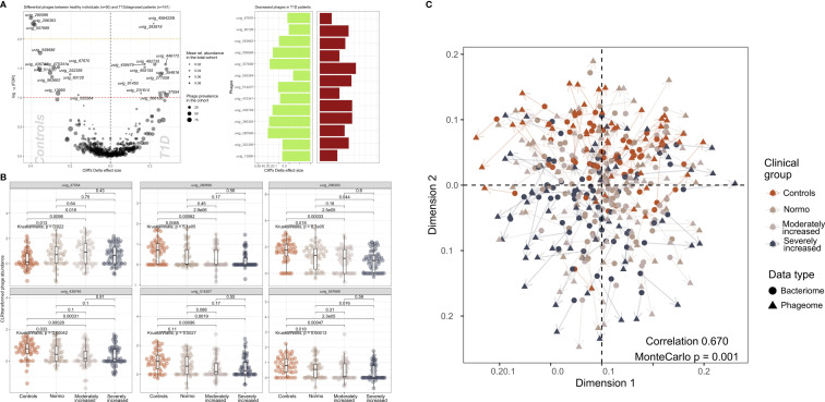
Contrasted relative abundance of bacteriophages in T1D and healthy control individuals. (A) In the left panel, a volcano plot compares the relative phage abundances between T1D and healthy individuals. The X-axis represents Cliff’s Delta effect size while the Y-axis represents the association threshold for the comparison, (negative log) FDR-adjusted p-value. Significantly contrasted phages (above the red dotted line) are annotated. Dot size is relative to the global prevalence of phage in the present study sample, while their transparency is relative to their mean abundance in the cohort. In the right panel, significantly contrasted phages are shown as bar plots corresponding to Cliff’s Delta effect sizes. Phages with significantly lower abundance in T1D are indicated as green bars while red bars represent phages with significantly higher abundance in T1D. (B) Distribution of abundance of selected phages when comparing healthy controls with the three groups of T1D stratified by albuminuria. For each phage, the CLR-transformed abundance distribution is represented in differently colored dots and boxplots showing the global group distribution. Multi-group comparison computed with Kruskal-Wallis test is included in each plot, as well as the pairwise comparisons between all study groups, performed with Wilcoxon test. (C) Comparison between the global composition of the phageome and the bacteriome, performed with Procrustes test. Principle coordinates analysis (PCoA) shows the disposition of individuals in the corresponding scores plot, for both bacteriome (circles) and phageome (triangles) based distance matrix. An arrow has been drawn connecting the same individuals. Individuals have been colored depending on their clinical group. Correlation and significance are indicated in the bottom right corner of the plot.

