Figure 5.
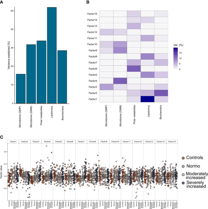
Multi-Omics Factor Analysis (MOFA). Results from multi-omics data integration after combining multiple data types: metagenomics data (taxonomical and functional), plasma metabolomics data (polar metabolites and clustered lipids) and biochemistry data using the MOFA+ tool. (A) Global explained variance for each of the data types (included in the integration step) has been represented as a bar chart. (B) Composition of 15 individual factors generated with the proportion of explained variance by each of the data types, displayed as a white-to-blue gradient in increasing order. (C) Distribution of the eigenvalues obtained for each of the factors for the combined dataset. Within each of those factors the individual, eigenvalues are represented as dot plots. Different colors in the dot plot depict different clinical study groups: orange for healthy controls, dark gray for T1D with normo-albuminuria, light gray for T1D with moderately increased albuminuria and black for T1D with severely increased albuminuria. Each of the study groups are also labelled in the bottom horizontal axis.

