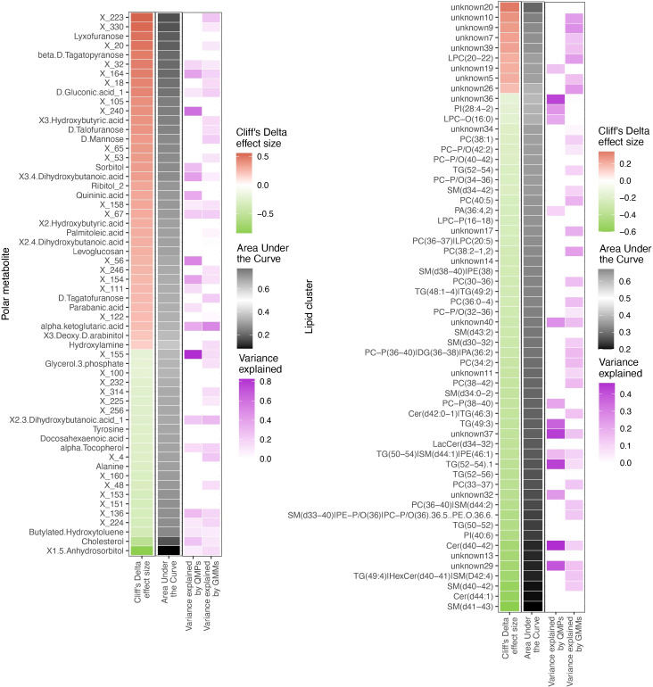
Figure 6.
Differentially abundant circulating metabolites and microbiome origin and functionality assessment. Summary of the circulating metabolites and lipids data integrated with gut microbiome origin and functionality in the T1D vs healthy controls comparison. The two heatmaps display significantly contrasted (FDR < 10%) polar metabolites (left) and lipid clusters (right) between T1D and healthy individuals. Column 1 (red green of each of the two heatmaps shows the Cliff’s Delta effect size for the clinical group comparison, ordered from higher to lower abundance in T1D individuals and colored from red (higher) to green (lower) gradient depending on its relative abundance in T1D individuals. Column 2 (black-white) shows the usefulness of the metabolite for discrimination between T1D and healthy individuals based on Area Under the Curve (AUC) analyses. The black-to-white-to-black gradient for AUC depicts assessment ability with 50% being uninformative AUC, 0% being the limit for the identification of healthy individuals and 100% being the limit for identification of T1D individuals. Column 3 (purple white) depicts relationship between the metabolites and bacterial QMP counts (absolute MGS abundance). Cells are colored if there is any significant association with metabolite levels (based on LASSO modelling) and the white-to-purple color gradient depicts the explained variance by the microbiome. Column 4 (purple white) depicts the relationship between the circulating metabolites and functional abundance of GMMs. Cells are colored if there is any significant association with metabolite levels (based on LASSO modelling) and the white-to-purple color gradient depicts the explained variance by the microbiome metabolic potential (or functionality).

