Figure 4.
Deep immune profiling of CD8+ T cells
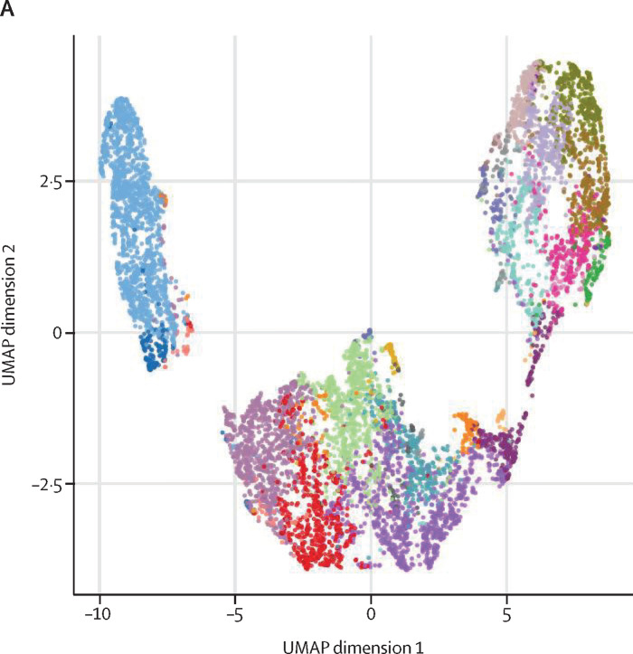
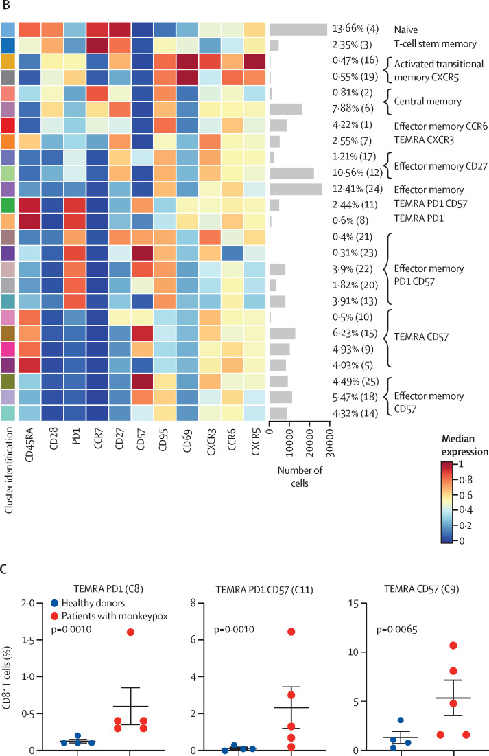
(A) Uniform Manifold Approximation and Projection (UMAP) plot shows the 2D spatial distribution of CD8+ T cells from healthy donors (n=4) and patients with monkeypox (n=5) embedded with FlowSOM clusters. The colour of each cluster corresponds to the colour of the heatmap in figure 4B. (B) Heatmap of the median marker intensities of the lineage markers across the 25 cell populations obtained with FlowSOM algorithm. The colours of cluster identification column correspond to the colours used to label the UMAP plot clusters. The colour in the heatmap is referred to the median of the arcsinh marker expression (0 to 1 scale) calculated over cells from all the samples. Light grey bar along the rows (clusters) and values in brackets indicate the relative sizes of clusters. (C) Relative cell proportion of different clusters between healthy donors (n=4), and Monkeypox patients (n=5). The central bar represents the mean (SD). CD=cluster differentiation. CXCR=chemokine receptors. TEMRA=T effector memory re-expressing CD45RA.


