Figure 2.
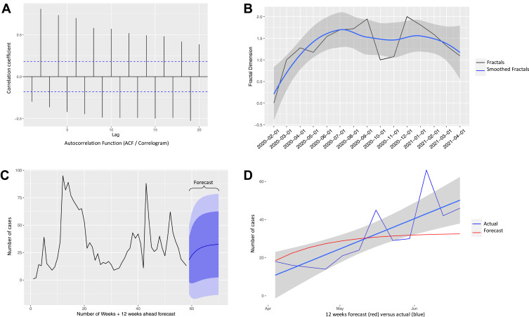
Autoregressive Fractionally Integrated Moving Average (ARFIMA) Forecasting of COVID-19 cases (A) Autocorrelation Function (ACF) plot or correlogram shows calculated autocorrelation coefficients per time lag, revealing a long memory process of both positive and negative cases. (B) The fractal dimensions plot shows a long memory process (6–7 months) for COVID-19. The black line is the actual fractal dimension and the blue line is the LOESS smoothing of the black line of positive cases for each month. (C) Count of all positive cases over the course of our data gathering and the ARFIMA prediction of the final 12 weeks (purple). (D) Testing our forecast model: Comparison of predicted count of positive cases (red line) versus count of actual cases (blue lines) in the past 3 months. The average error was 1.9 cases per week. The model only deviates from actual in the “far future” (late June), which is expected from any prediction of future. The unexpected rise in the number of actual cases may also be the result of the new delta variant.

