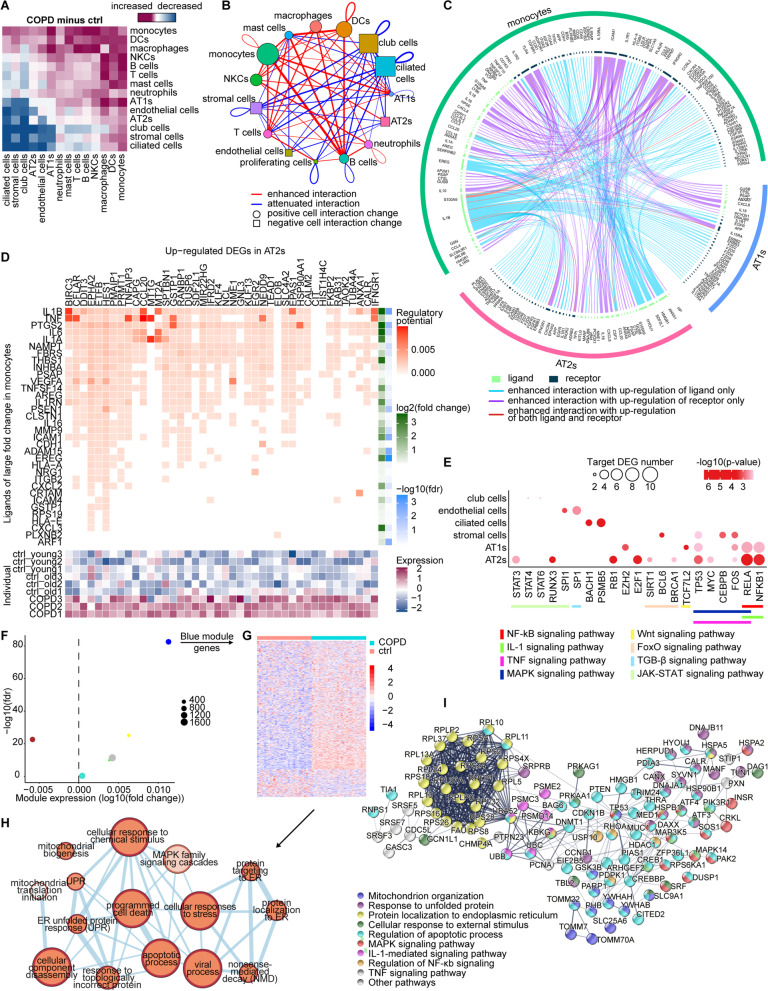
Fig. 4.
“COPD core” pathologies: Altered intercellular communications and pro-apoptotic effect of monocytes on AT2s. A Heatmap representing the changes of the number of ligand-receptor interactions in CCIs among 15 cell types predicted by CellPhoneDB between COPD and control lungs. The colors from red to blue represent changes of CCIs from increased to decreased. B Network reflecting the quantification of the changes of the ligand-receptor interactions number in CCIs among 15 cell types showed in A. Only the changes of interaction > 10% increase/decrease are shown in the network. Red lines connect the cells showing enhanced interactions in COPD lung, while blue lines connect those showing attenuated interactions. The thicker the line, the greater the change of interaction. Circle represents positive total changes of CCIs of a certain cell type, while square represents negative one. The larger the square or circle, the greater the total changes. Each cell type is represented by a unique color. C Circos plot showing the ligand-receptor pairs responsible for the enhanced CCIs among monocytes, AT1s, and AT2s predicted by CellPhoneDB, for which monocytes are either sender cells or receiver cells. Each light green inside arc represents a ligand and each dark green one represents a receptor. Blue lines link ligands and receptors showing enhanced interactions with up-regulation of ligands only. Purple lines link ligands and receptors showing enhanced interactions with up-regulation of receptors only. Red lines link ligands and receptors showing enhanced interactions with up-regulation of both ligands and receptors. D The top heatmap showing the potential of ligands of large fold change (log2(fold change) > 0.14 or log2(fold change) < − 0.14) in monocytes (on the y-axis) regulating the up-regulated COPD-associated DEGs in AT2s (on the x-axis) predicted by NicheNet analysis. The fold change and false discovery rate of these ligands are shown in 2 separate heatmaps on the right. The mean gene expressions of the up-regulated COPD-associated DEGs in AT2s across 9 samples are shown in the lower heatmap. The mean gene expression per sample is represented as a z transformed value (across all samples). E Dot plot showing the number of predicted target DEGs of the potential upstream transcription factors on the x-axis in the given cell types on the y-axis. The potential upstream transcription factors are grouped by their pathway annotations which are represented by lines in different colors. p-values are indicated by dot color; The numbers of target DEGs are indicated by dot size. F Scatterplot showing the co-expression gene modules of AT2s detected by WGCNA analysis. The x axis represents the log2(fold change) of modules’ expression under COPD, and y axis shows the statistical significance of modules’ association with COPD. Each circle represents a module, whose size is proportional to the number of genes in the module. G Heatmap showing relative expression of 838 genes in Blue module. All cells within COPD or control are randomly clustered into 30 groups, and then averages of expression are calculated within each group, resulting in 30 transcriptomic profiles each for COPD and control, which displays a distinct overall up-regulation in COPD lungs. H Enrichment network demonstrating functional topologies among major biological processes of Blue module. Each biological process is represented by a node whose size is proportional to the number of genes enriched in the biological process and color darkness is proportional to enrichment significance. The connecting line represents the overlapping genes between two biological processes, whose thickness is proportional to the percentage of overlapping. I Functional interaction network is constructed for Blue module genes enriched in more than 2 biological processes in H by STRINGDB with active interaction source from experiments only. Each node represents a protein with its encoding gene labelled. Each edge represents the interaction between the two proteins. Line thickness indicates the strength of data support. Proteins are clustered according to their pathway annotations which are reflected by the colors of circles. Disconnected genes are not shown

