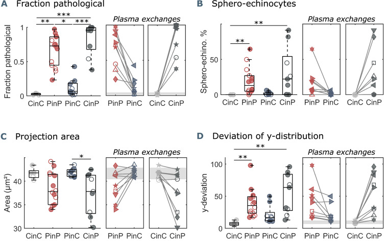
Figure 2. Parameters used for microfluidic flow analysis for the four sample groups.
(A) Fraction of pathological RBC shapes, (B) percentage of sphero-echinocytes, (C) RBC 2D projection area in a velocity range of 1-3 mm s-1, and (D) deviation of the RBC distribution in y-direction based on the average of controls (CinC) in a velocity range of 5-10 mm s-1. Left panels (A–D) show data as boxplots with superimposed individual data points. Filled symbols correspond to samples that are included in the metabolomics and proteomics analyses (Figure 3 and Figure 4). The bottom and top of each box are the 25th and 75th percentiles of the sample, respectively. The line in the middle of each box is the sample median. Whiskers go from the end of the interquartile range to the furthest observation. Data beyond the whisker length are marked as outliers with ’+’ signs. * refers to a significance level of p<0.05, ** to p<0.01, and *** to p<0.001. Right panels (A–D) show the effect of plasma exchange for individual donors. Gray areas correspond to the mean and standard deviations for controls (CinC) of the corresponding data.

