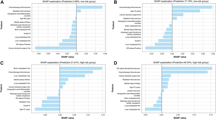
FIGURE 6.
SHAP explanation based on the optimal model. (A) Patients with a predicted probability of 2.69% were classified into the low-risk group; (B) patients with a predicted probability of 17.19% were classified into the low-risk group; (C) patients with a predicted probability of 31.91% were classified into the high-risk group; (D) patients with a predicted probability of 45.54% were classified into the high-risk group. In each plot, features are ranked according to importance in individual cases. Every feature can obtain a weight in reference to x-axis score. When there is a light-blue bar located at the left of the plot, it denotes that the feature was a protective factor, while that located at the right of the plot represents that the feature was a risk factor. Patients' predicted probability of early death and category of risk groups are shown in the plot.

