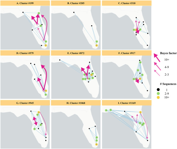
FIG 5.
The largest HIV-1 subtype B clusters in Florida mapped by county, with arrows representing the rates of spatial-temporal diffusion between regions (north, central, and south) inferred by Bayesian analysis. Black dots represent counties with one sequence in a cluster. Green dots represent counties with two to nine sequences in a cluster. Yellow dots represent counties with >10 sequences in a cluster. Numbers in dots show actual number of sequences in the cluster. Arrow width and color correspond to the strength of evidence available for these diffusion rates, as indicated by the adjusted Bayes factors (Table S4). Patterns of migration from the south to north and south to central Florida were observed for cluster #199 and #579. Migration from central to north Florida was observed for cluster #199, #310, #872, #945, and #1169. Migration from central to south Florida was observed for clusters #310, #872, and #917. We also observed evidence of migration from north to central Florida (cluster #945) and weak evidence from the north to south regions (cluster #945 and #1169). The migration patterns for clusters #205 and #1068 are unknown as the results were not well supported after adjusting for sampling bias.

